Pages & Page Designer
Overview
Pages create the user interface for your applications, enabling data display, data capture, and user interactions. The Page Designer provides both assisted visual design and manual coding options to create sophisticated user interfaces that integrate seamlessly with your DataSets and business logic.
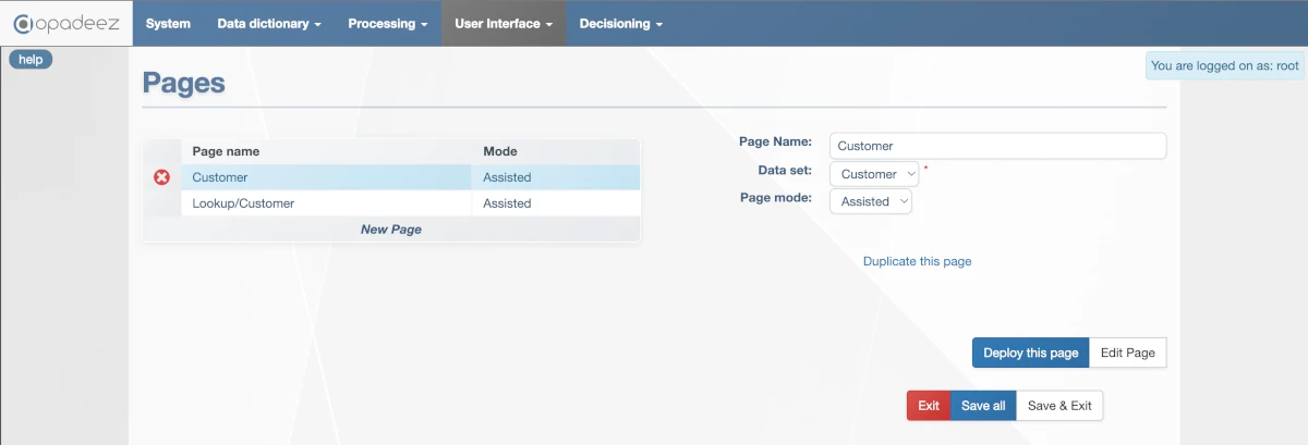
Page configuration interface showing page properties, DataSet selection, and page mode options
What are Pages?
Pages are user interface components that:
- Display Information: Present data from DataSets in user-friendly formats
- Enable Data Capture: Provide forms and controls for user input
- Support Lookups: Display search interfaces for record selection
- Integrate Workflows: Connect with flows for complete business processes
- Provide Navigation: Enable users to move through application functions
Page Configuration
Page Name
- Purpose: Unique identifier for the page
- Requirement: Must be unique across all pages
- Organization: Use folder syntax:
folder/subfolder/pagename - Best Practice: Use descriptive names that indicate page purpose
Data Set
- Purpose: Links page to specific DataSet for data access
- Integration: Aliases and fields from DataSet can be used on page
- Requirement: Must reference existing DataSet definition
- Context: Determines available data and relationships for page
Page Mode
Defines how pages are built and maintained:
External
- Purpose: Page built outside the Studio
- Requirement: .jsp file provided in deployment package (webcontent/pages folder)
- Use Case: Complex custom interfaces or third-party integrations
- Control: Full control over HTML, CSS, and JavaScript
Assisted
- Purpose: Page built using visual Page Designer
- Interface: WYSIWYG drag-and-drop design environment
- Editing: Click "Edit Page" button to launch designer
- Best For: Most common page types and rapid development
Manual
- Purpose: Page coded in JSP within Studio
- Interface: Text editor for direct JSP coding
- Editing: Click "Edit Page" button to launch text editor
- Best For: Advanced customization and complex logic
Page Management Functions
Duplicate This Page
- Purpose: Create copy of current page
- Naming: New page named "PageName (copy)"
- Use Case: Create variations of existing pages
- Efficiency: Saves time when creating similar pages
Deploy This Page
- Purpose: Apply page changes to runtime without full restart
- Development: Useful during development for quick testing
- Limitation: Only applies to page changes, not dictionary or script changes
- Usage: Refresh browser page to see changes
Edit Page
- Manual Mode: Launches text editor for JSP code modification
- Assisted Mode: Launches visual Page Designer tool
- Context: Behavior depends on selected Page Mode
- Integration: Direct access to appropriate editing environment
Assisted Page Designer
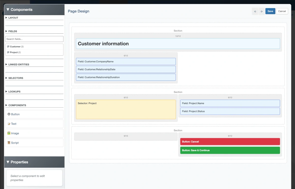
Assisted Page Designer showing WYSIWYG design area and component toolbox
The Assisted Page Designer provides visual page creation with drag-and-drop components:
Designer Components
- Design Area: WYSIWYG page structure definition
- Toolbox: Component library for adding page elements
- Properties: Configuration options for selected components
- Preview: Real-time view of page appearance
Toolbox Components
Layout
Structure components for page organization:
- Section: Logical grouping of related components
- Layout: Grid and positioning controls for component arrangement
- Organization: Creates visual hierarchy and structure
- Responsive: Supports different screen sizes and devices
Fields
Primary UI components for data display and capture:
Field Properties
- Alias: Entity alias from DataSet (non-editable)
- Field: Specific attribute to display (non-editable)
- Label: Display text (uses Attribute label if blank, field name if both blank)
- CSS Class: Custom styling classes
- Read Only: Field editing restriction (may be overridden by Attribute rules)
- Mandatory: Required field indicator (may be overridden by Attribute rules)
- Display: Visibility rule using JSP syntax
<%= someJspVariable %> - Index: Record selector for 1-many relationships (blank uses current selection)
- Style: Select Textarea for multi-line entry
Field Usage
- Search: Use "Search fields..." to filter available fields
- Drag-Drop: Add single or multiple fields to page
- DataSet Integration: Fields automatically linked to DataSet structure
- Validation: Inherits validation rules from Data Dictionary
Linked Entities
Components for selecting related records through 1-many relationships:
Configuration
- Alias: Linked entity alias (e.g., Customer) (non-editable)
- Display: Fields shown in dropdown/search box
- Label: User instruction text (e.g., "Select a customer:")
- Order: Sort field for displayed records
- Filter: SQL filter for record selection (e.g.,
CustomerType = "A") - CSS Class: Additional styling classes
- Read Only: Selection restriction
- Mandatory: Required selection indicator
- Refresh Page: Reload page when selection changes
Display Types
- Dropdown (default): Standard dropdown list selection
- Autocomplete: Text box with auto-complete functionality
Selectors
Components for displaying and managing 1-many relationship records:
Core Properties
- Alias: Entity to display (e.g., Project) (non-editable)
- Titles & Display: Fields and column headers for table format
- CSS Class: Additional styling classes
- Auto Order: Automatic alphabetical sorting by columns
- Translate Values: Show ValueList text instead of codes
Display Types
- Numbers: Display records as numbered list (1 - 2 - 3)
- Array: Display records in table format
User Actions
- Show Add: Link for creating new records
- Show Delete: X icon for record deletion
- Add Label: Custom text for add link
- Add Action: Script/action triggered after adding record
- Delete Label: Custom text for delete link
- Delete Action: Script/action triggered when deleting record
Ordering
- Order Field: Numeric field storing record position
- User Control: Arrows for end-user record reordering
- Persistence: Order changes saved to database
Lookups
Components for integrating search functionality:
Lookup Parameters
- Label: User instruction for parameter meaning
- Value (optional): Fixed parameter value (hidden from user)
- Mandatory: Required parameter for lookup execution
- CSS Class: Custom styling classes
Lookup Search Button
- Text: Button display text
- CSS Class: Custom styling classes
Auto Search Options
- False: Results shown only after button click
- Once: Results fetched automatically on first load
- Always: Results updated every time lookup displays
- Refresh: Results updated only after user has searched before
Button Styles
- Button: Default button appearance
- Button-default, button-warning: Bootstrap styled buttons
- Link: Display as text link instead of button
Lookup Results
- Label: Header text for results section
- CSS Class: Custom styling classes
- Translate Values: Show ValueList text instead of codes
- Allow Open Locked: Enable opening records locked by other users
Result Actions
- None: Display-only results
- Open (default): Selected record becomes active in DataSet
- Assign: Selected record assigned to specified alias
- Assign Alias: Target alias for assignment action
Buttons
Interactive components for user actions:
Button Properties
- Text: Display text for button or link
- CSS Class: Additional styling classes
- Display: Visibility condition using JSP syntax
- Confirmation Message: User confirmation dialog before action
Predefined Actions
- Exit: Exit current flow or sub-flow
- Previous: Move to previous page in flow
- Next: Move to next page in flow
- Save: Save current data context
Custom Actions
- Actions: List of custom actions when no predefined action selected
- Flexibility: Support for complex business logic
- Integration: Can trigger scripts, flows, or other components
Button Styles
- Button: Default button appearance
- Button-default, button-warning: Bootstrap styled buttons
- Link: Display as text link instead of button
Text
Components for static content display:
Text Sizes
- Normal: Standard body text
- Header 1: Main page title
- Header 2: Section titles
- Header 3: Subsection titles and highlights
Image
Components for visual content:
Image Properties
- Path: Relative or absolute path to image file
- Width: Image width with CSS units (100px, 50%)
- Height: Image height with CSS units (100px, 50%)
- Align: Left or right alignment
Script
Components for custom code integration:
Script Properties
- Title: Display name in Page Designer
- Edit: Link to code editor
- Content Types: HTML, JavaScript (<script>), CSS (<style>), JSP (<% %>)
- Integration: Code inserted directly into JSP page
Page Development Workflow
Planning Phase
- Define Purpose: Determine page functionality and user goals
- Select DataSet: Choose appropriate DataSet for data requirements
- Plan Layout: Sketch page structure and component placement
- Consider Navigation: Plan integration with flows and menus
Design Phase
- Choose Mode: Select Assisted, Manual, or External based on requirements
- Create Structure: Use Layout components for page organization
- Add Components: Drag-drop Fields, Selectors, Lookups as needed
- Configure Properties: Set labels, validation, styling for each component
Testing Phase
- Deploy Page: Use "Deploy This Page" for quick testing
- Test Functionality: Verify all components work as expected
- Validate Data: Ensure proper data binding and validation
- Check Responsiveness: Test on different screen sizes
Best Practices
Page Design
- User-Centric: Design based on user workflows and needs
- Consistent Layout: Use consistent spacing and alignment
- Logical Grouping: Group related fields and functions
- Clear Labels: Use descriptive, user-friendly field labels
Performance
- Efficient Lookups: Use appropriate filters and result limits
- Minimal Scripts: Keep custom scripts lightweight
- Optimized Images: Use appropriate image sizes and formats
- Selective Loading: Use display conditions to show relevant content
Maintenance
- Organized Naming: Use folder structure for page organization
- Documentation: Document complex page logic and customizations
- Version Control: Track page changes and versions
- Testing: Thoroughly test pages after DataSet or flow changes
Integration with Other Components
DataSet Integration
- Field Binding: Automatic connection to DataSet attributes
- Validation Rules: Inherits rules from Data Dictionary
- Relationship Navigation: Support for entity relationships
- Data Context: Maintains current record and selection state
Flow Integration
- Page Actions: Flows can display pages using "page" action
- Button Actions: Page buttons can trigger flow actions
- Data Sharing: Pages and flows share DataSet context
- Navigation: Seamless movement between pages and flows
Menu Integration
- Menu Display: Pages can be displayed from menu items
- Parameter Passing: Menu parameters available in page context
- Permission Control: Page access controlled by menu permissions
- Navigation Context: Pages maintain menu navigation state
Getting Started
Ready to create pages? Follow these resources:
- Data Set Definition: Understand DataSet structure for page design
- Flows: Learn how to integrate pages with workflows
- Your First Application - Part 4: See page creation in practice
Related Topics
- Menu Definition: Creating navigation to pages
- Lookups: Understanding lookup integration in pages
- Standard Actions: Using actions in page buttons